Choosing the paint colors for our house was a huge undertaking.
Some of the best advise I got during the process was from my good friends at Budeke’s Paints, that you need to see the actual color in the house at various times of day. Paint colors change, they morph. Depening on light the same color can pull various shades and undertones. What you love in the store you may hate in your space.
STEP 1:
Go to multiple paint stores (Sherwin Williams and Benjamin Moore are my favorites) and pull as many paint chips as you want. Bring them into the space you’re painting and look at it on the wall at various times of day. With hundreds of choices of every shade it can be a daunting task- but seeing the color in your home in the natural light will drastically help narrow your search.

STEP 2:
For larger projects (more than an accent wall) once you think you have decided I would actually paint the wall. Since you’ll need to purchase small containers of paint I recommend narrowing the choices to 2 or 3 colors. You can also purchase a product that you paint and stick to the wall so you don’t have to actually paint your walls. I never care to just paint the walls since I am going to anyway. But, this is a great product for things like cabinets or furniture. Again watch the colors change throughout the day. I was almost positive I wanted to go with a SW color after seeing it on various blogs online and Instagram. But once I had it on my walls it was far too bright- sterile almost in my house. I was looking for a softer white with no yellow undertones.
Step 3:
Paint! Ask your local paint supplier for recommendations on the best products. Trust me this part is bigger than you think. After working with a Benjamin Moore company for the past 4 years, I learned how important this is. The color is just the beginning. Selecting the sheen, product and tools will also drastically impact the outcome and the longevity of your project.
The KFH Colors:
The exterior was a hard choice. Again, I wanted a true white that didn’t pull yellow or beige. The exterior is painted with Benjamin Moore Chantilly Lace. This is a cool white paint with only slightly blue undertones. I hate to talk about undertones because for the most part the untrained eye doesn’t see this. When comparing whites I recommend placing them next to each other in actual lighting. Then it is easier to see if they pull yellow (warm) or blue (cool).
The interior was easier because I knew i wanted to basically have three main colors throughout the entire house. Since the floor plan is so open I wanted it to all flow. There aren’t many walls that “close” off a room so painting one wall and stopping would be difficult.
The walls in almost every room are Sherwin Williams City Loft. I wanted something bright and close to white without the sterile feeling. City Loft is a beautiful pale taupe-gray that will brighten any space. Trust me it looks almost white in direct sun. it’s just warm enough though that you see a contract between the pure white of the trim– which was the goal.
The trim is all painted in SW Snow Bound. My favorite SW white.
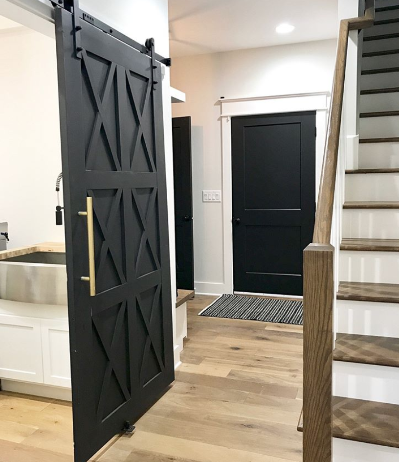
For the black accents throughout the house I wanted a cool true black. Although I love BM Wrought Iron and almost went with this for our doors, it is more of a dark grey. I was torn between SW Tricorn and Black Magic. Honestly I love both. In the end I went with Black Magic. It was the perfect mix of modern elegance and a classic tones and it paired so well with City Loft and Snowbound. Tricorn, although a super beautiful black, tends to pull more grey/blue.
Have questions about paint colors? I am happy to help. Send an email, drop a comment or DM me on Instagram @Knoxfarmhouse.
